Reports
Overview
All the data you insert in WETHOD are used to generate, weekly and automatically, a set of reports useful to monitor the projects’ progress.
Project Report
Each Monday, utilising data provided by Timesheet, Project Status and Budget, a Project Report is automatically created.
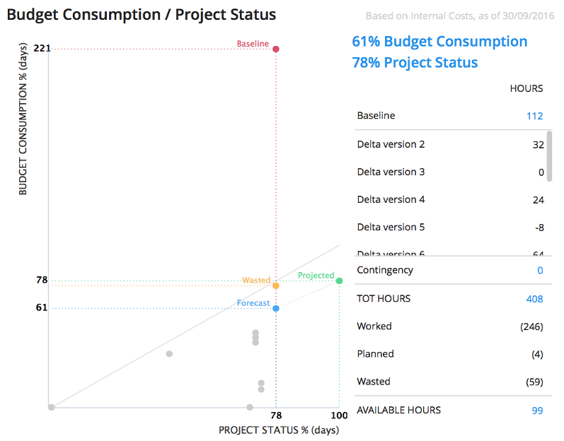
Budget Consumption / Project Status
This section shows the budget consumption of the project, compared to its progress:
- If the project is above the diagonal: it’s using a lot of days but it’s progressing slowly than predictions based on budget;
- If the project is under the diagonal: it’s using few days but it’s progressing faster than predictions based on budget;
- If the project is on the diagonal: it’s planned and managed correctly.
By analyzing the saved budget versions for the project, WETHOD can shows you:
- The baseline which answers the question “what would the situation be if I hadn’t changed the budget since its first version?“;
- The forecast which answers the question “what’s the situation right now?”;
- The projected which answers the question “what will be the situation at the end of the project with the current budget consumption?”;
- The wasted which answers the question “what’s the situation right now, wasted hours included?”;
The grey dots shows you the forecast of the various past budget versions.
On the right of the graph you have:
- Baseline: the first budget’s hours amount;
- The variations of the budget’s hours amount since the baseline was approved;
- Contingency;
- Forecast: the current budget’s hours amount (Baseline + variations + contingency);
- A resume of the worked, planned, wasted and still available hours.
Invoices & Orders
Here are listed all the orders and invoices linked to the project, clicking on one of them will take you to the related details.
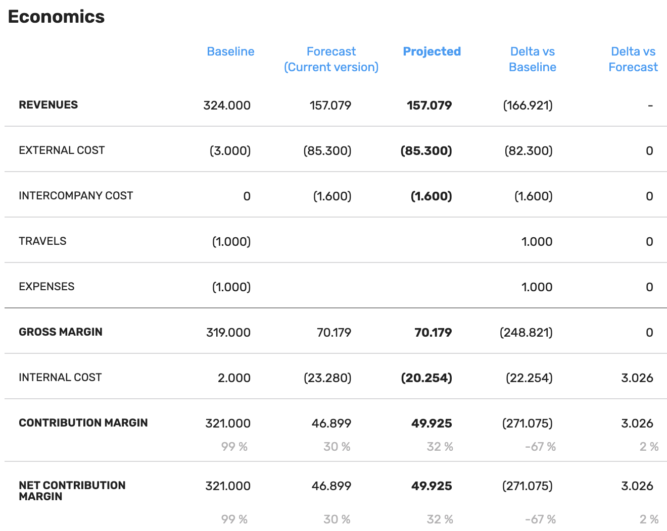
Economics
Here is shown the trend of various budget’s voices for the project:
- Revenues: the project’s final net price
- External Cost: the sum of all budget’s external costs (travels, expenses and intercompany costs) excluded
- Intercompany Cost: the sum of the external costs of all intercompany tasks in the budget (this value is only shown if there are intercompany cost tasks)
- Travels: external costs related to “Travels” budget’s task
- Expenses: external costs related to “Expenses” budget’s task
- Gross Margin: final net price without external cost, travels and expenses
- Internal Cost: budget’s hours cost
- Contribution Margin: gross margin without internal cost. This value tells you how much a project is able to cover fixed costs
- Wasted: the “wasted” money, which is the sum of the wasted hours multiplied by the cost of their levels
- Net Contribution Margin: the difference between contribution margin and wasted
For each indicator you can see its value for:
- The baseline: first approved budget’s version & current progress
- The forecasts: last approved budget’s version (a.k.a. current version) & current progress
- The projected: last approved budget’s version & progress at 100%. Here internal cost comes from compiled timesheets
- The delta vs baseline: difference between projected and baseline, this tells you how the project would be if you had not changed the first budget version
- The delta vs forecast: difference between projected and forecast, this gives you an idea of how the project will end if you stick to the current budget version
The grey percentage under margin can be read as margin against revenues.
Note
If project is over, projected external costs comes from sent orders and projected travels comes from travels’s costs
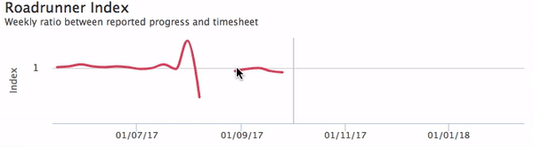
Roadrunner Index - Days Left - Worked Hours
This three charts let you appreciate the trend of three primary indexes related with the project’s progress:
- Days Left: data from the Project Status are transposed into this chart to better highlight the weekly progress of the project;
- Worked Hours: data from the Timesheet are used into this chart to visualize the weekly amount of work spent on the project;
- Roadrunner Index: combining data from the two previous charts let us display the weekly Roadrunner Index for the project.
This is the only place in WETHOD where you can see the weekly details of a given project.
When worked hours grows, days left must decrease. If this doesn’t happen, you have a problem: your teammates are working on something which doesn’t move forward and this is highlighted by a Roadrunner Index which differs from the ideal value of 1.
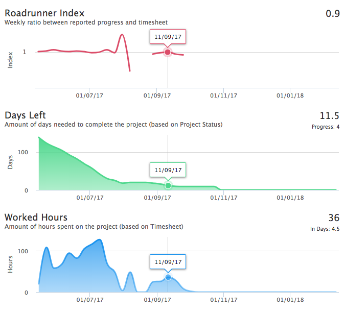
Need a more detailed view? Just click and drag on a chart to include the area you want to zoom.
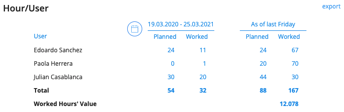
Hour / User
Here are reported, for each teammate who has worked on the project, the comparison between his/her worked hours and his/her planned hours.
Below “As of last Friday” you can see all the worked and planned hours until last Friday.
Clicking on the calendar icon you can select a custom period and based on the type of timesheet they are using two behavior are in place:
- Detailed timesheet: the exact dates chosen in the time range are used to filter results, both for worked and planned hours.
- Non-detailed timesheet: the entire week of the start and end dates are considered while fetching data. This applies to both worked and planned hours.
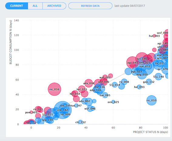
Consumption vs Status
This is an overview of all Projects in terms of resources and time spent on the project, allowing you to analyse their health at a glance.
For each pipeline’s project, its budget consumption is compared to its progress:
- If the project is above the diagonal: it’s using a lot of days but it’s progressing slowly than predictions based on budget;
- If the project is under the diagonal: it’s using few days but it’s progressing faster than predictions based on budget;
- If the project is on the diagonal: it’s planned and managed correctly.
Using filters, you can select the Projects you want to see and explore details such as billed hours, invoiced totals, and internal and external purchase orders.
Projects with a Job Order Category with flag “UNLIMITED PLANNING” enabled are hidden from this chart because it makes no sense to calculate the budget consumption of a project with unlimited available days.
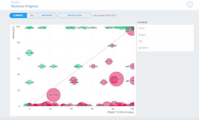
Invoiced vs Status
This report compares the projects’ status with the percentage of their value which is already been invoiced.
How to read the project’s position on the graph:
- If the project is above the diagonal: more work days than the actually done have been invoiced;
- If the project is under the diagonal: not al work days done for the project have been invoiced;
- If the project is on the diagonal: project status and invoiced percentage are consistent, this means that until now all the work days done has been invoiced.
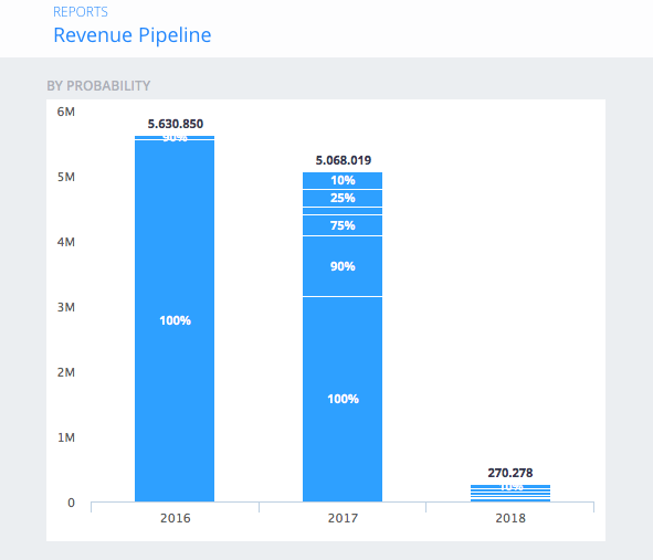
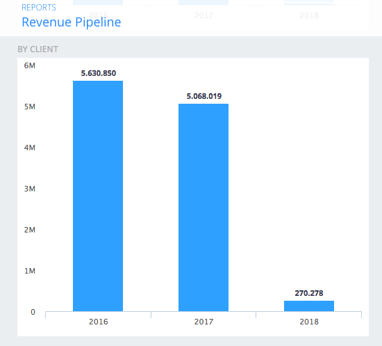
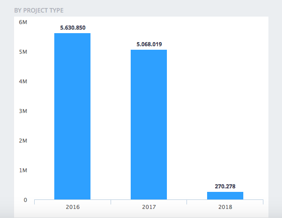
Sales Pipeline
This report is composed by four sections which aggregate the revenue pipeline by probability, by client, by project type, by project type’s group or by metadata.
Each section shows a column diagram, where each column refers to a particular year (previous, current, next) and its generated by the projects which invoice plan hits that year. Clicking on a column will show a right panel with further information linked to the column itself.
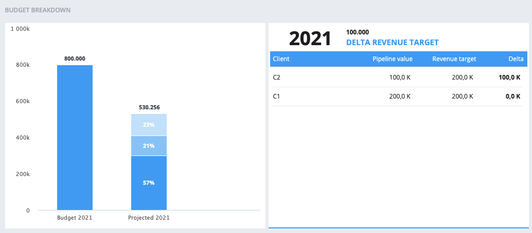
A different kind of report is the budget breakdown which shows the company budget compared to the projected revenues for the current year. The projected revenues are divided into production coming form the projects in pipeline, revenues bluesky and the remaining delta revenue target.
Budget Breakdown
Clicking on the sub column representing bluesky or delta revenue target will show a panel listing all the grouped clients with their:
- Name;
- Pipeline value: value coming from their projects in pipeline;
- Revenue target;
- Delta: Difference between target and value;
By Probability
Each column is divided into sub-columns which group projects with different probability.
Clicking on a sub-column will show a panel listing all the grouped projects with their:
- Name;
- Client’s name;
- Value;
- Probability;
- Expected value.
By Client
Clicking on a column will show a panel listing all the grouped projects with:
- Client’s name;
- Value;
- Percentage of influence on the revenue pipeline.
By Project Type
Clicking on a column will show a panel listing all the grouped projects with their:
- Name;
- Value;
- Percentage of influence on the revenue pipeline.
By Project Type’s Group
Clicking on a column will show a panel listing all the grouped projects with their:
- Name;
- Value;
- Percentage of influence on the revenue pipeline.
By Metadata
This chart gives valuable insight only if metadata tags are used on projects or opportunities. Learn more on how to add metadata tags here
This chart is by default filtered on “No Metadata”, meaning that only projects and opportunities with no metadata tags are considered.
Change filters by selecting first a metadata tag and then a metadata value.
Clicking on a column will show a panel listing all the clients (based on the filters applied) with:
- Client’s name;
- Value;
- Percentage of influence on the revenue pipeline.
Items on the list are ordered by value.
Revenues 🆕
Note
This is the first release of a new, broader section dedicated to reports within wethod. We are updating the documentation as we roll out new features to ensure you have complete support. Please note that this section is evolving, with new features to be added over time to enhance your management and analysis experience.
To view this section, you must have the “view” permission for “Charts.” You can check this in the Permissions section.
In this section, you can create charts related to your company’s revenues.
The first time you access this section, you will find:
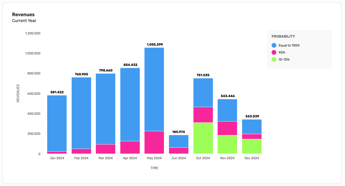
- The “Revenues” chart, showing the current year’s revenues, divided by month and grouped by probability cluster. This chart cannot be edited or deleted.
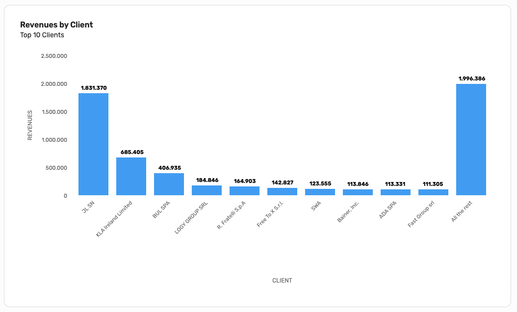
- The “Revenues by Client” chart, which is a child of the “Revenues” chart, showing the top 10 most profitable clients. This chart cannot be edited or deleted.
Each chart can have child charts that inherit the filters applied to the parent.
Each chart also has a child table that shows detailed information about the projects included in the parent chart.
Creating a new chart
To create a new chart, you must have the “edit” permission for “Charts.” You can check this in the Permissions section.
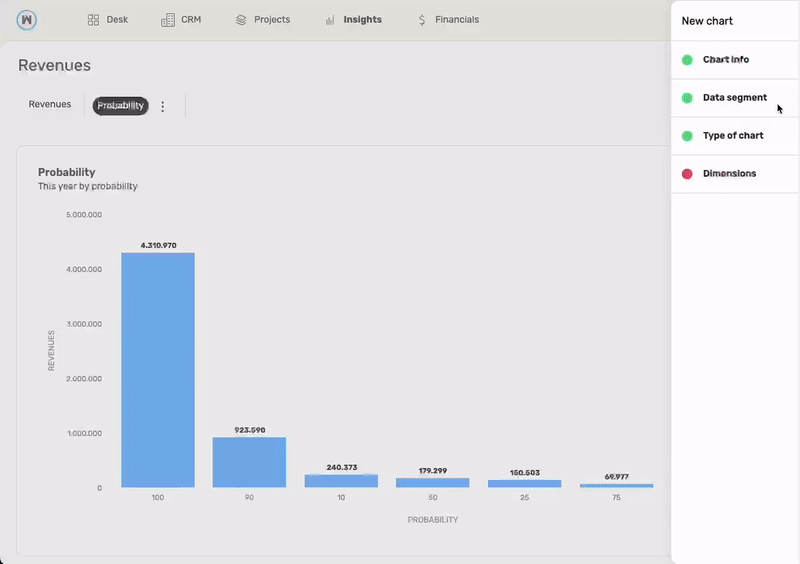
By clicking the “Add chart” button, you will be prompted to enter some information about the chart you want to create:
- Chart info: chart name and a brief description
- Data segment: filters to apply to limit the data to be considered
- Type of chart: the type of chart to use for data visualization
- Dimensions: values to assign to each chart dimension. For example, if you’ve selected a Bar Chart, you will need to specify which values to display on the chart’s x and y axes.
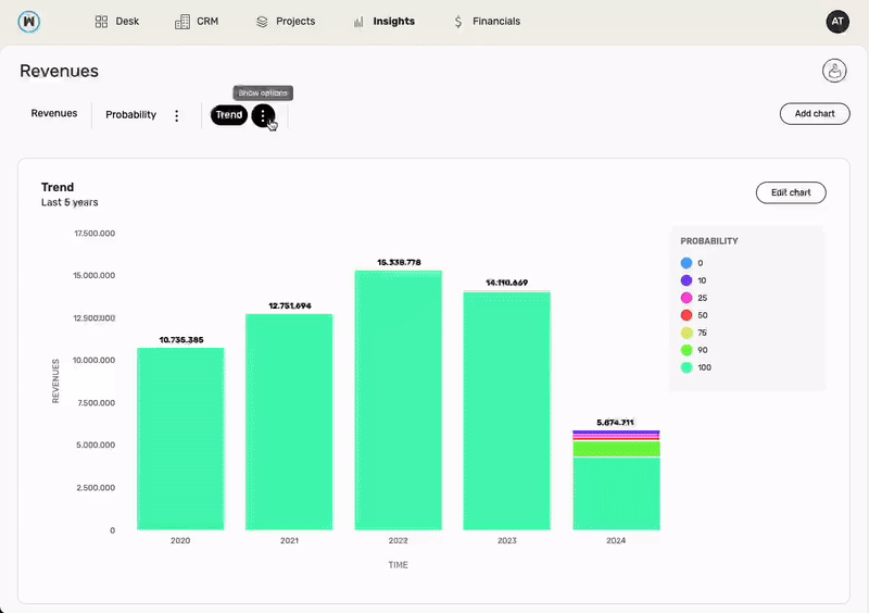
Editing a chart
To edit an existing chart, you must have the “edit” permission for “Charts.” You can check this in the Permissions section.
You can then click the “Edit chart” button to modify the selected chart.
Deleting a chart
To delete a chart, you must have the “edit” permission for “Charts.” You can check this in the Permissions section.
You can click the three dots next to the chart’s name to access the option to delete it.
Click to filter
You can click on a point in a chart to use it as a filter for child charts and child tables. For example, if you click on a point in the “Revenues” chart that groups all revenues for December related to projects with a 90% probability, the child charts will be filtered to show only the points related to December with a 90% probability.
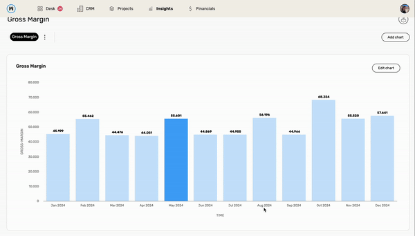
Gross Margin 🆕
We’ve introduced a new dimension, “Gross Margin,” which uses data from the “Total” row in this section of the table: Economics.
The data segment filters and dimensions are consistent with those in the “Revenues” section. However, the only numeric dimension here will be “Gross Margin” (instead of “Revenues”).
Each chart can have child charts that inherit the filters applied to the parent.
Each chart also has a child table that shows detailed information about the projects included in the parent.
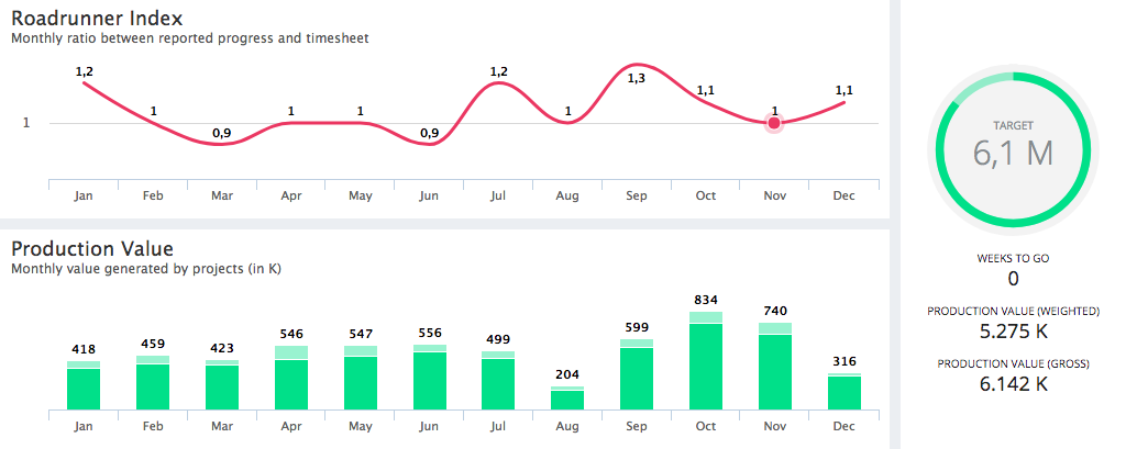
Production Value
Here you can find an overview of the annual projects’ production value. Each month is displayed as a two overlapped columns:
- The brilliant-green area (the lower one) represents the production value weighted on the projects’ probability. So, if a project has got a production value of 100 K but a probability of 90%, it concurs with 90 K to the month’s weighted production value
- The opaque-green area (the higher one) represents the gross production value that is, basically, a non weighted production value. So each project concurs with the 100% of its production value
Above the production value’s chart there’s the monthly Roadrunner Index which aggregates the pipeline’s projects’ Roadrunner Indexes by month.
On the right you can see the Revenue Clock which tells you:
- The production target, as set in Profit&Loss Budget Target
- The amount of weeks remaining until the end of the year (the grey area shows the percentage of the year gone )
- The yearly weighted production value, by clicking on this area you can access the details about the yearly production value grouped by client, by project or by week
- The yearly gross production value
- The part in opacity represents the total value of opportunities (with less than 90% of probability to be won), meanwhile the full colored represents all won project’s total value (with 90% of probability or more).
By clicking on a specific month you can access that month’s production value grouped by client, by project or by week.
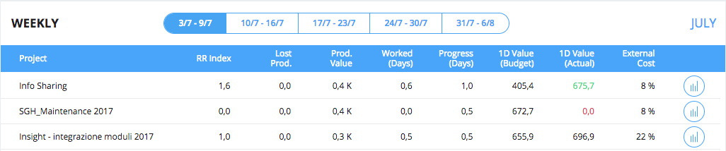
By Week
In this view you can see, for each project (and for the selected week):
- The roadrunner index;
- The lost production: let’s say people worked on a project for A hours and the project progressed of B hours. If A is greater than B you’ve used more hours than expected and this value gives you how much production you’ve lost;
- The production value;
- The worked days: how many days people have worked on the project during the selected week;
- The progress: how many days the project has progressed during the selected week, that is the difference between the selected week project status and the previous one;
- The 1D Value (Budget): estimated daily production value, that is “what is the expected value that must be produced for the project by day?”. This is calculated by dividing the project’s estimate by the project’s budget days;
- The 1D Value (Actual): actual daily production value, that is “what is the value produced for the project by day?”. This is calculated by dividing the project’s production value by the project’s worked days. This value is green if it’s greater than 1D Value (Budget), red otherwise;
- The external cost: project’s external cost percentage on the total estimate. This is the same for each week of the project
You can switch between month’s week by using the selector placed at the top of this section.
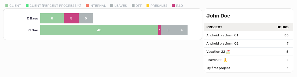
Weekly Timesheet
This is a weekly overview of the timesheets made by your teammates, each timesheet is coloured as the job order category of the project it’s linked to and you can see the project’s name by clicking on its timesheet.
On the top left corner you can filter the displayed people.
On the top right corner you can change the week of the displayed timesheets.
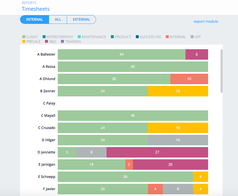
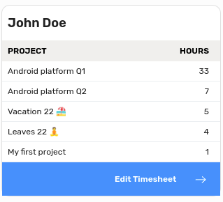
You can see the details by clicking on a person’s name.
Users with ‘edit other’ timesheet permission can also go to the colleague’s timesheet page from the details box.
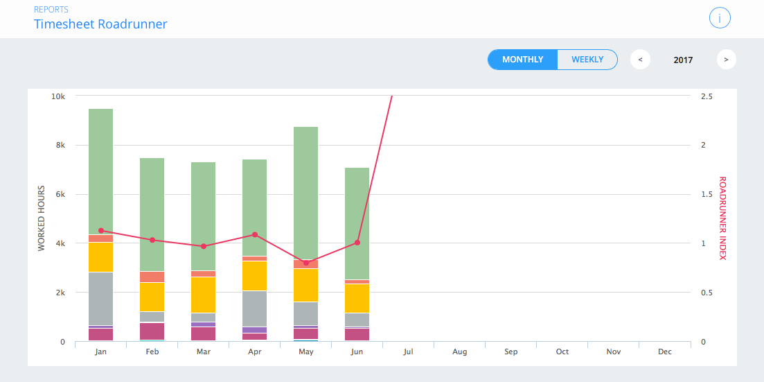
Timesheet Summary
This report shows all the timesheets for the selected year, grouped by Job Order Category and compared to the Roadrunner Index.
You can chose between monthly and weekly visualization via the selector on the top of the section, where you can also find the year selector.
Timesheet Report
WETHOD allows you to move the worked hours between projects in order to give you the most flexible way to work.
This functionality allows to redistribute logged hours from one project to another within your company.
By leveraging this feature, you can efficiently manage and optimize project resources based on evolving priorities and needs.
Report
Here you have a complete overview of the amount of hours each employee has assigned to each project, the table can show specific data based on the filters you can enter or you can easily search for an employee or project by typing the name or job order into the search box.
Transfer Hour
To transfer hours from one project to another you must first of all
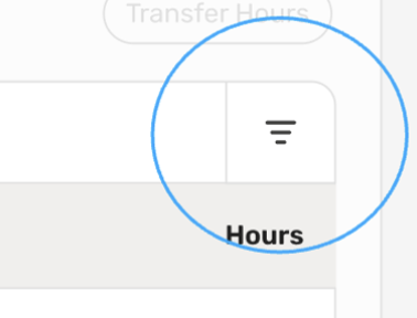
- Select a project to start from, so click on the filter on the right of the search bar
- Under the Project Name section search for your project and select it.
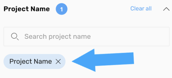
- Now the Transfer Hour button will be enabled and the table will show only the hours only for the project you choose.
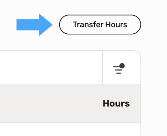
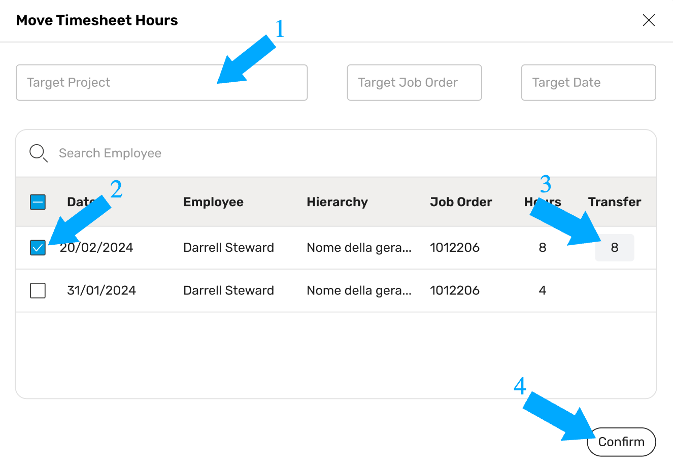
Doing so will open a Move Timesheet Hours window, from here it will be possible to actually move the hours.
Note
Make sure that the target project selected in the window is the one you want, otherwise you can search for another one either by name or by its job order.
Now we can proceed moving the hours:
- Select the Target project using the Target Project dropdown or the Job Order dropdown
- Select the row corresponding to the hours of a specific employee who worked on the project, you can also select more than one row per transfer, we suggests to perform a one big transfer for a better performance.
- Enter the amount of hours to move towards the final project per each row you selected.Change the destination date if different from that of the selected row
- Press Confirm to perform the transfer
Timesheet Log
Any operation of transferring hours or recording hours on the timesheet is recorded.
On this page you can consult the list of logs of the actions performed.
Each column of the table is described in detail below:
- Employee — The employee linked to that specific timetracking finds reference to the timesheet
- Date — The reference timetracking date, this changes based on the timetracking mode of the operation in question which can vary from WEEKLY to DAILY to DETAILED, in the event that the operation refers to WEEKLY timetracking then in this column it will be shown on Monday of the same week.
- Mode — The timetracking mode of the row
- Project — the project of the row in question, this field varies if the row operation is a transfer, in which case the project from which the hours were transferred will be shown.
- Job Order — The job order of the project from the previous column
- Hours — The amount of hours to which the operation refers, i.e. if changes have been made to the timesheet these are the hours: added, modified or deleted. If the operation was a transfer then these are the total hours transferred.
- Update Date — The date of the operation
- Updated By — The name of the employee who performed the operation
- Transferred To — If the operation was a transfer, the name of the destination project will be shown here otherwise this will be empty.
We underline that this table can be searched from the appropriate bar and it is possible to apply filters to facilitate consultation.
Project Changelog
Here are listed all the changes done on value or probability of pipeline’s projects.
For each change you can see:
- The name of the project which has been changed;
- The name of the change’s author;
- The change’s date;
- The old value and the updated value;
- The old probability and the updated probability;
- The difference between the updated and the old expected value.
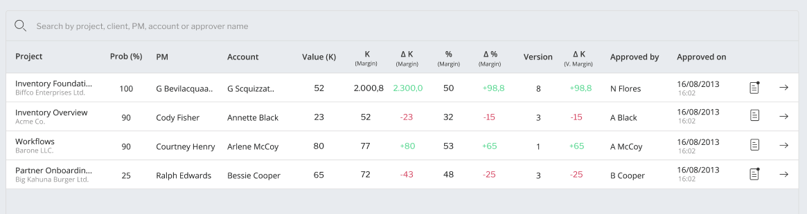
Budgets Approval
Here you can find a list of all the budget’s approvals, each one with:
- Project’s name, probability, client, account, manager, value
- Budget’s version
- The person who approved the budget and the relative message, if any;
- The timestamp for the approval
- Margin’s value in K
- Final net price’s margin in percentage
- The difference between final net price’s margin and suggested net price’s margin in K and percentage. These values are highlighted in red if negative and green otherwise
- The difference between the budget final net price’s margin and the previous version final net price’s margin.
Project & Team Reviews Changelog
Here are listed all the project & team reviews sessions requested in your company throughout a year, sorted chronologically.
Find in the list information like:
- the name of the project for which was requested a review;
- who requested the review and when;
- the number of reviews collected since the request was sent out. This number will be green if the review is completed, red if the review is still under completion.
For each of the listed project review requests, you will be able to:
- Resend a new review request to the team of the project.
- Delete it, along with all the results collected so far.
- Head to the project’s canvas
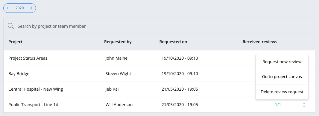
Note
This section is available only if project & team reviews are enabled for the company.
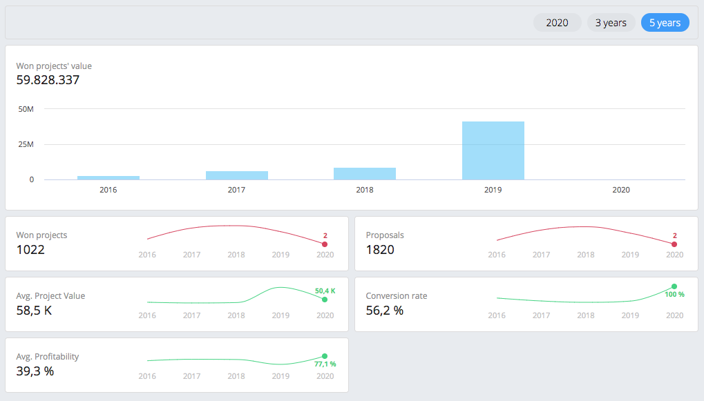
Sales Overview
Here you can have a summarized view about all the chargeable projects your company won or lost during different periods of time, together with a bunch of reports:
- The value of the won projects for the client grouped by years or quarters (click on a column to further filter the insights below on the selected time range)
- Sparklines:
- Won projects the number of all the won chargeable opportunities (with a 90% or 1oo% probability) in the selected time range
- Proposals the number of all the chargeable opportunities created for all your clients in the selected time range
- Avg. Project Value the average value of all the won chargeable projects in the selected time range
- Conversion Rate the ratio between won projects and all the opportunities in the selected time range
- Avg. Profitability: the average margin of all the won projects in the selected time range
- Won projects are all the won chargeable opportunities with a 90% or 100% probability
- Lost projects are all the lost chargeable opportunities with a 0% probability
- Outstanding projects that are all the chargeable opportunities with a probability between 10% and 75%
Backlog
This section shows production related data, let’s see each chart:
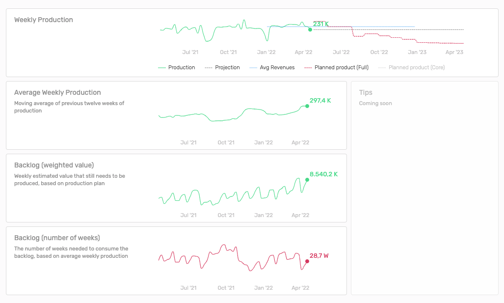
- Weekly Production plots various data ranging from one year in the past to one year in the future:
- Production: weekly production for the last 52 weeks
- Projection: value produced in the last week and projected on the future
- Avg Revenues: revenues target (set from profit & loss) divided by the number of weeks in the current year. This is the ideal weekly revenues that should be hit
- Planned product (Core): weekly production plan of projects with probability greater than 90%. This gives us a look on the production we think will come from projects that are very likely to start
- Planned product (Full): weekly production plan for all projects
- Average Weekly Production: for the last 52 weeks shows the weekly production moving average (based on the previous 12 weeks). Using a moving average you can appreciate more the general trend instead of focusing on the single peaks
- Backlog (weighted value): shows the amount of production plan in your pipeline for each week of the previous year. This helps us track the evolution of the company production expectations
- Weeks Backlog: shows how many weeks of work your company needs to produce the entire backlog for each week of the last year (week’s backlog / week’s production). This can be summarized by the question “How many weeks of work do we have in front of us if we stop accepting projects right now?”
- Tips: 🔜 This section will show useful tips based on your company production, production plan and backlog
Briefing
Briefing is content that includes all the relevant insight within your company’s production, sales, and financials, on a weekly and monthly basis.
This transparent overview gives the entire team the knowledge to stay aligned on what has been done and what needs to be done in the weeks to come, in order to reach the company’s goals faster.
To collect better insights, it’s recommended to set a revenue budget/forecast for each year in the Profit & Loss section.
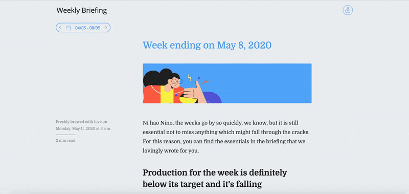
Weekly Briefing
Published each Monday at 6 am, the Weekly Briefing gives an insightful overview of the company’s sales and operations from the past week. It’s also available for each of the previous weeks.
Navigation: Insights > Briefing > Weekly
Find below a list of the insights available to read from each Weekly Briefing.
- Production value, compared with its average weekly target. The value is also compared with the one registered the same week last year. An average weekly target is basically the yearly budget/forecast divided by the number of weeks in a year. A dynamic weekly target is the yearly budget/forecast minus the production value up to the selected week divided by the number of week till the year end.
- Projects that produced the most value.
- Projects started and projects that ended last week.
- Sales trends, compared with their weekly target.
- Projects won and their total value, compared with their target and the same week last year.
- Pipeline value trend over the past few weeks.
- New opportunities, with their total unweighted value and weighted value. A weighted value depends on the project’s percentage of success. For instance, a project valued 100K at 10% success is valued at 10K.
- The main reason why projects were lost and won.
- Chargeability of the week trend. This value is compared also with its target and the value of the same week last year.
- Number of hours worked.
- Segmentation of hours worked, grouped by job order category.
Note
Set a revenue target for the year in the Profit & Loss section to get better insights.
Monthly Briefing
Published every first Monday of the month at 6 am, this briefing gives an overview of the most important results in the company’s sales, operations, and financials during the past month. It’s also available for each of the previous months.
Navigation: Insights > Briefing > Monthly
Find below the insights available from each Monthly Briefing.
- Company’s monthly profit and loss, including CapEx and revenues per employee. These values are also compared with the results of the previous month.
- Production value, with its trend over previous months and comparison with its target
- Working day value, compared with the value of the month before.
- Road Runner Index RRI trend over the past months.
- Number of hours worked and Chargeability trend.
- Number of projects won, with their total value compared with target, and the same week last year.
- Projects that produced the most value.
- Pipeline value, with the trend over the previous weeks.
- New opportunities, with the total weighted and unweighted value. A weighted value depends on the project’s percentage of success. For instance, a project valued 100K with 10% success is valued at 10K.
- Lost opportunities, with the total value and the main reasons why
- Pipeline value trend over the past months
- Backlog
Note
Set a revenue budget/forecast for the year in the Profit & Loss section to get better insights.
People Insights
This section provides a series of insights on the team in your company, using the available data within the platform.
Navigation: Insights > People
Demographics
This page gives a demographic overview on the active population in your company. Explore trends and characteristics of your team with a sequence of charts and within a set of time ranges.
Navigation: Insights > People > Demographics
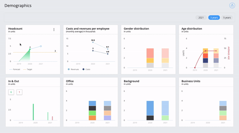
- Headcount: (in units) this chart shows the amount of active employees in your company. The information is based on the quantity of positive payrolls within the shown timeframe. The forecast, which also considers the number of placeholders in the current quarter/year, is represented with a dashed line compared to the past quarters/years. A headcount target can be added and edited from the widget’s options button.
- In & Out: (in units) this chart shows the number of employees hired in your company (in green) or that left your company (in red) for each quarter of the current year, in the last 3 or 5 years. The forecast, which also considers the number of placeholders in the current quarter/year, is represented in low opacity compared to the past quarters/years.
- Costs and revenues per employee: (monthly average, in K) this chart shows the monthly average costs and revenues per employee. The average is calculated taking into account the amount of employees shown as headcount for the given period of time. The forecast, which also includes the current quarter/year, is represented with a dashed line compared to the past.
- Gender distribution: (in units) this chart shows the gender distribution in your company. Each team member can express their gender identity from the contact information section inside their profile page. The current quarter/year is still considered as a forecast, therefore it is represented in low opacity compared to the past quarters/years.
- Age distribution: (in units) this chart shows the age distribution and its average trend in your company. To better digest this information, Wethod divides the population belonging to a given set of age ranges: less than 20 years old, 20-29, 30-39, 49-49, 50-59, and more than 60 years old. The current quarter/year is still considered as a forecast, therefore it is represented in low opacity compared to the past quarters/years.
- Tag charts: (in units) this chart(s) show(s) tags demographics which vary depending on your company’s preference. To add tags to a team member head to the Team settings, choose a tag category name and add tag names to team members. The current quarter/year is still considered as a forecast, therefore it is represented in low opacity compared to the past quarters/years.
- Business units: (in units) this chart shows the business unit demographics of your team. The current quarter/year is still considered as a forecast, therefore it is represented in low opacity compared to the past quarters/years.
Chargeability
This page gives an overview on the average chargeability – amount of hours worked on profitable projects – of each user level and team member respectively in one year (quarterly), in three or five years.
Navigation: Insights > People > Chargeability
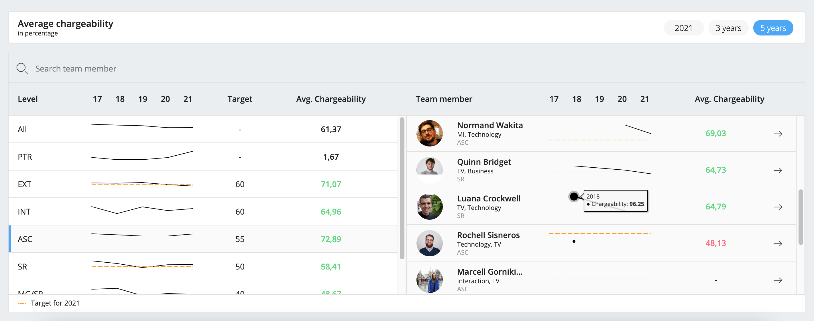
On the left you find a list of all the user levels in your company. For each of those, wethod gives an overview of the average chargeability by quarter or by year. It also shows if the average chargeability is negative (red) or positive (green) compared to their target.
If you click on a user level from the list on the left, wethod shows all the team members belonging to (and that belonged to) the selected user level.
For each team member is shown the average chargeability and its trend. The latter refer to the period of time in which the team member belonged to the selected user level.
When you select “All” wethod shows a list of all team members with their overall chargeability trend.
All team members’ list are sortable by the average chargeability.
- Set a chargeability target: An orange dashed line represents the chargeability target which can be set specifically for each user level from the company settings
Kudos
This page gives an overview on the average kudos – votes received as part of a review – of each criterion as team member or pm respectively in one year (quarterly), in three or five years. Changing the selected period will affect the “As Team Member” and “As Pm” tables both.
Navigation: Insights > People > Kudos
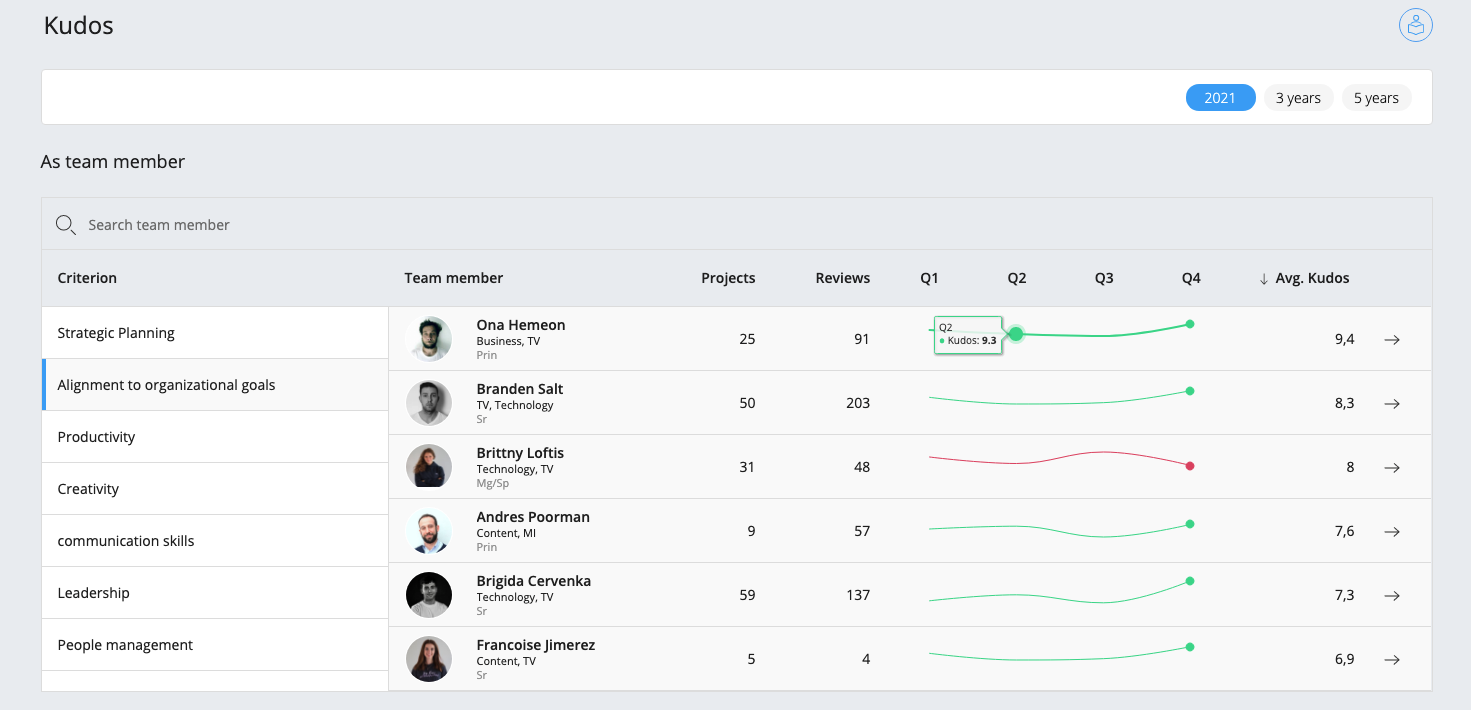
On the left you find a list of all team’s criteria in your company.
If you click on a criterion from the list, wethod shows all the users that have received a review for that criterion.
For each of those, wethod gives an overview of the average kudos by quarter or by year.
It also shows if the average kudos has been decreasing over time (red) or not (green) compared to the highest value.
The users’ list is sortable by the average kudos vote.
Please mind that users that haven’t received the minimum amount of reviews required for your company are hidden from the criterion list.
For each user the average vote and its trend are shown.
Additionally the following values are listed:
- Projects: Represents the number of projects for which the user has received a review, according to the selected criterion.
- Reviews: The total of kudos the user has received for the criterion selected on the left.
- Enable the project and team review module: Turn on the project and team review module in order to view the kudos section. To start collecting reviews about projects and people working on them you should enable the module from the company settings. There you can also set the minimum number of unique reviewers to collect feedback from before showing results.
Knowledge
This section lets you know your team and their strengths better, providing an overview of the knowledge of the active population in your company.
You can find useful information about the languages spoken within your company, and all the skills and interests of your team.
Navigation: Insights > People > Knowledge
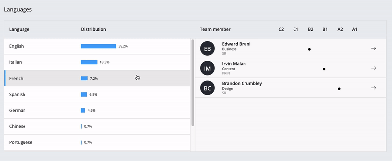
Languages: the table shows the list of languages spoken within your company, with the percentage distribution of each one.
When you select a language, by clicking on it, you can get an overview of the team members who speak it, from the most confident to the novice ones.
For each person, it is therefore shown the level of experience in the selected language.
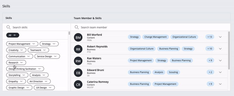
Skills: here you can find a complete list of all the skills your colleagues have developed.
By clicking on a skill you will see a list of the team members who have that particular one.
Note that when you turn on more than one skill you will only see the people that developed all the selected abilities.
You can also turn on the filter ‘All’: this lets you see the entire team at once.
For each person you can see an overview of acquired skills, giving priority to the ones selected from the list on the left side.
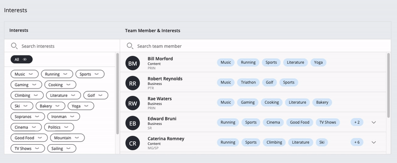
Interests: here you can find a complete list of all the interests your colleagues have.
By clicking on an interest you will see a list of the team members that are into that particular one.
Note that when you turn on more than one interest you will only see the people that chose all the selected topics.
You can also turn on the filter ‘All’: this lets you see the entire team at once.
For each person you can see an overview of his interests, giving priority to the ones selected from the list on the left side.
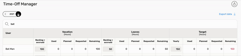
Time-off Manager
Particular job order categories may be used to represent time off, that are hours spent out of work. Time off can come in different flavors:
- Vacation: the annual and usually paid time you get off work
- Leave: refers to time when you can go away from your job
- General if it does not need to be tracked in special ways
Differences between “vacation” and “leave” time off are probably meaningful only in Italy where they’re legally distinct items.
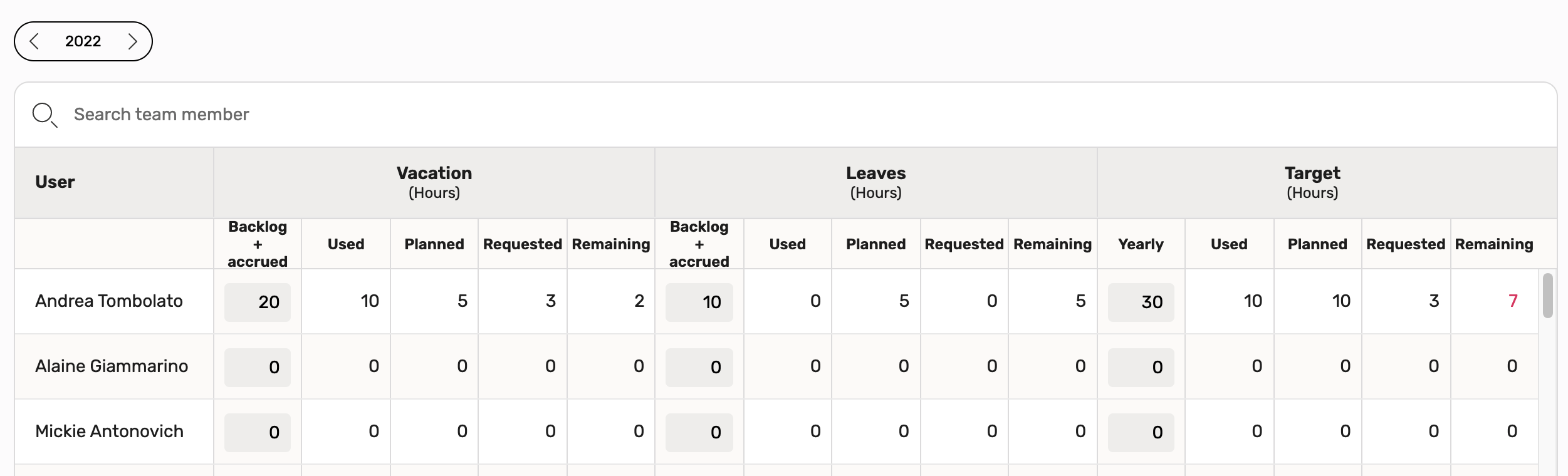
“Time-off manager” section is where you can manage vacation and leave time off for each user.
A project can be flagged as “Vacation time off” o “Leave time off” using the “Hours type” job order category flag available in company settings section.
In this section are visible, for each user by year:
- Name
- Vacation and Leave time off
- Backlog + accrued: this is editable by users with edit permission
- Used: timesheet hours for projects with job order category vacation/leave time off
- Planned: planning hours for projects with job order category vacation/leave time off
- Requested: hours requested but not approved yet for projects with job order category vacation/leave time off. Hours can be requested using Allocation Requests section
- Remaining: Backlog - used - planned - requested
- Target
- Yearly: leave + vacation time off hours that user have to use during the year. this is editable by users with edit permission
- Used: leave + vacation used time off hours
- Planned: leave + vacation planned time off hours
- Requested: leave + vacation requested time off hours
- Remaining: target - used - planned - requested
You can download all data in the time off manager with the dedicated export button.
The export contains data of the visible year you selected. To change the export year navigate to the desired date with the buttons on top of the page.
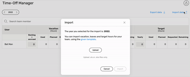
You can also import data of the time off manager with the dedicated import button.
The import can include data of the visible year you selected. To change the import year navigate to the desired date with the buttons on top of the page.
You can upload a file with .xls or .xlxs extension containing the backlog of vacation, leaves and target hours for every employee in your company.
From this dialog you can also download the appropriate template you can use for the import.